Color Schemes in Landscape Design: Paint Your Garden with Purpose
Chosen theme: Color Schemes in Landscape Design. Discover how palettes shape mood, guide movement, and unite plants, hardscape, and seasons into memorable experiences. Join our community—share your favorite garden colors and subscribe for fresh, palette-driven inspiration.
The Psychology of Outdoor Color
01
Warm vs. Cool Hues in the Garden
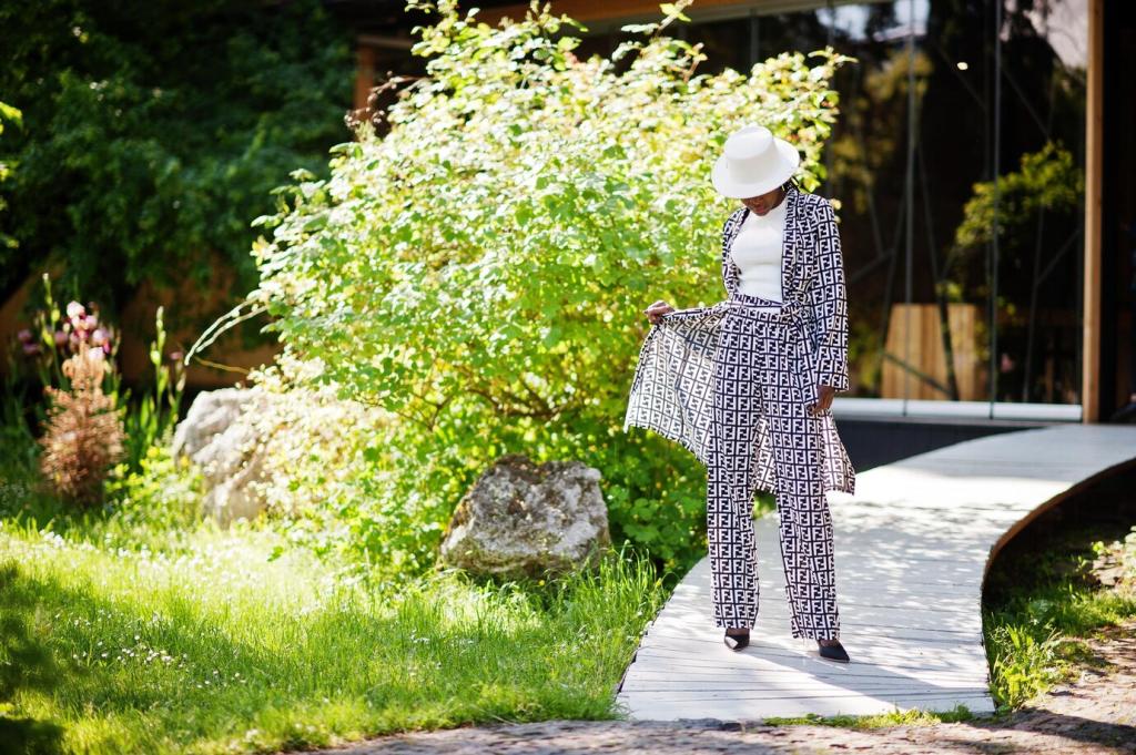
Warm reds, oranges, and yellows pull the eye forward, creating energy and intimacy, while cool blues and greens visually recede, expanding space and encouraging reflection. Try layering warm accents near seating areas and cool hues along boundaries to shift perception and comfort.
02
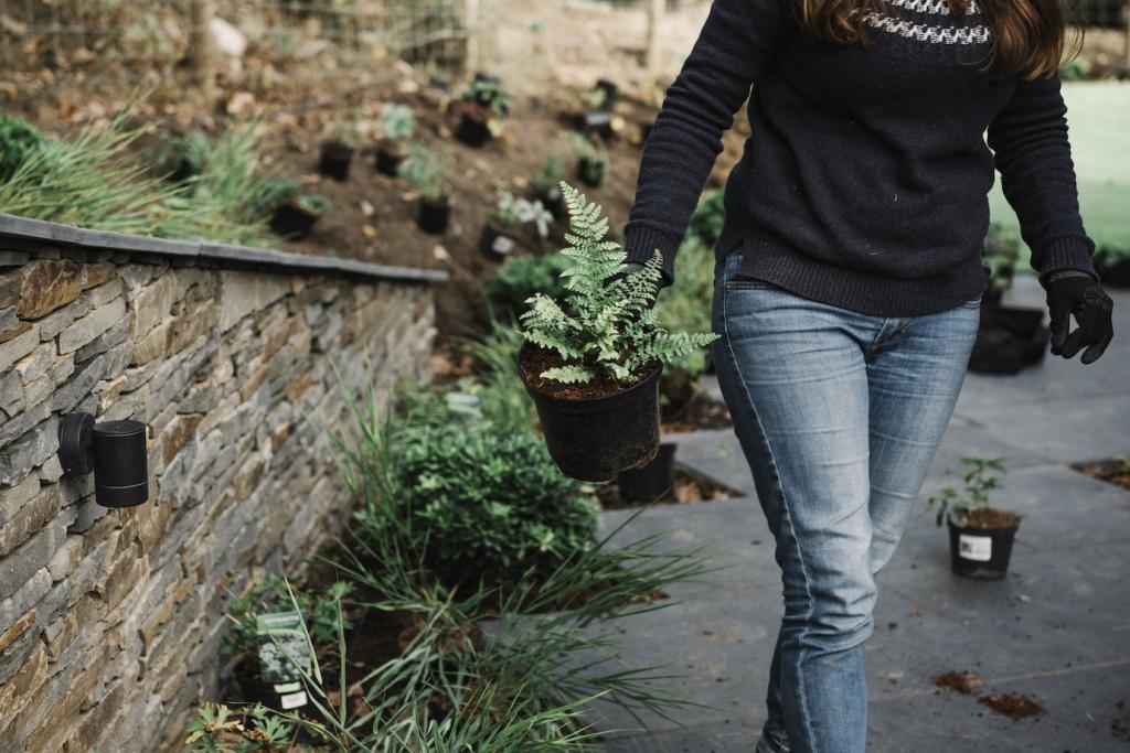
Mood Setting Through Palette Choices
A bold, high-contrast scheme sparks conversation at gatherings, while a restrained, tonal palette whispers serenity after a long day. Before planting, ask what you want to feel at dusk: energized, grounded, or soothed. Comment with your goal mood to guide your next palette.
03
Color as Wayfinding
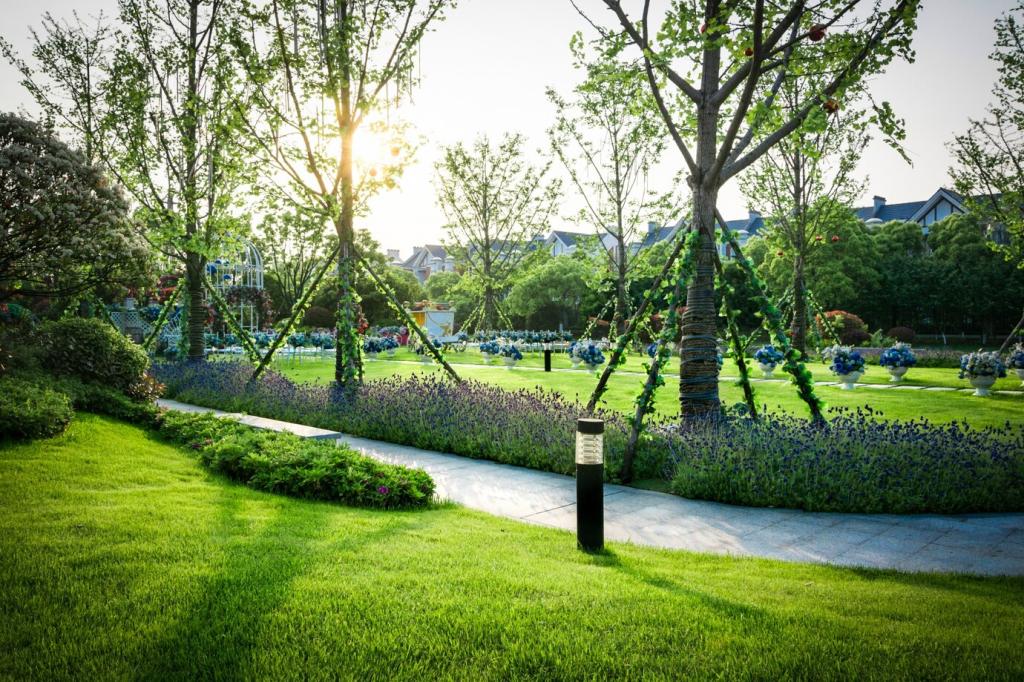
Strategic color cues can guide movement: a ribbon of bright blooms suggests a path, while repeated cool notes encourage lingering. Use recurring accents to define destinations—a cobalt pot, a saffron bench, or white blooms around a reading nook. Tell us where your garden should lead.
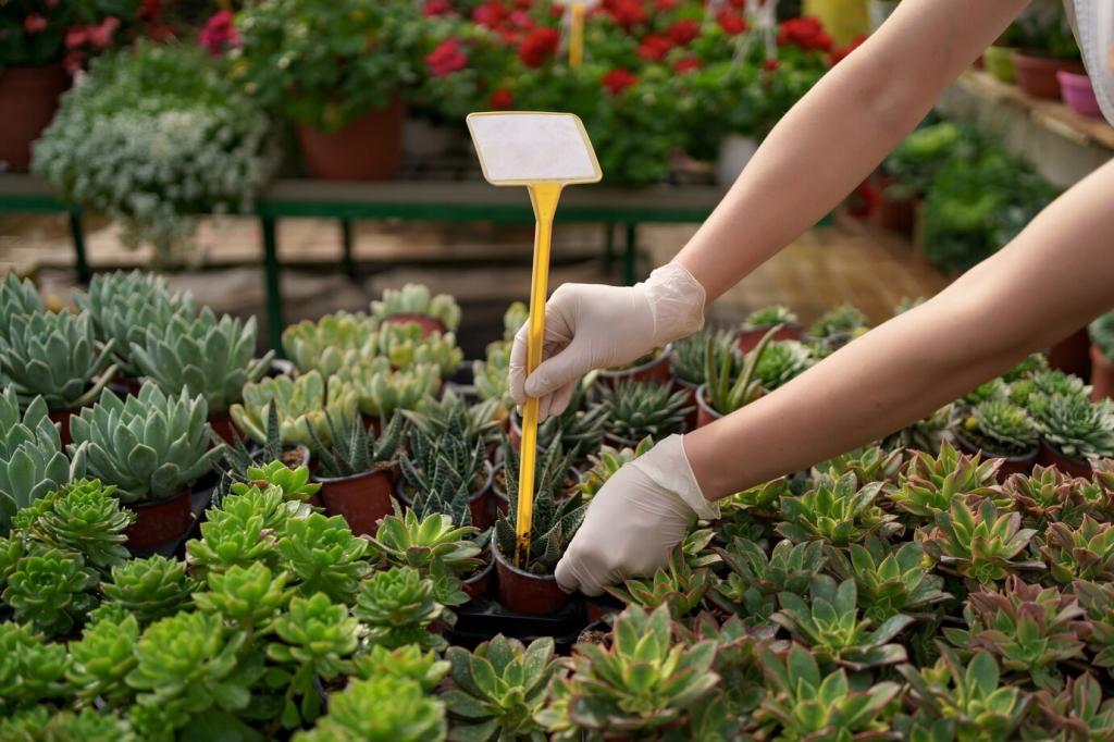
Layer chartreuse, emerald, and deep forest foliage to build depth without visual noise. Mix broad leaves, fine needles, and glossy groundcovers; texture becomes your drama. Add mossy stones and green-glazed containers for cohesion. Comment if you’re team all-green and why it works for you.
White blooms and silver foliage glow at dusk, extending your garden’s evening life. Dusty miller, white roses, and lamb’s ear shimmer under warm lighting. Keep forms bold and clean to avoid muddiness. Share your favorite night-bloomers for a luminous, peaceful retreat.
From pale periwinkle to inky indigo, a spectrum of blues cools hot afternoons. Combine blue fescue, hydrangeas, and ceramic accents, then temper with gray gravel. The palette softens edges and invites slow breathing. Subscribe for plant lists tailored to shade and sun in blue gardens.
Analogous Harmony That Flows
Sunset Palette: Red to Gold
Blend coral, tangerine, and honey-yellow blooms for a warm, glowing border. Let colors overlap gradually through transitional plants like peach dahlias. Use bronze grasses to echo warmth and maintain cohesion. Tell us your favorite sunrise or sunset hue to anchor the scheme.
Woodland Edge: Green to Blue-Green
Hostas, ferns, and blue-green hellebores create a cool understory. Add teal glazes and slate stepping stones to unify tones. The subtle shifts relax the eye and echo forest calm. Share a snapshot of your shade corner for feedback on smoothing color transitions.
Waterside Calm: Aqua to Indigo
Near ponds, layer aqua, turquoise, and deep indigo with rippling grasses to mirror water. Repeat tones in cushions and lanterns for continuity. Keep blooms minimal so reflections and foliage carry the scene. Subscribe for our waterside planting blueprint and lighting tips.
Foliage-First Palettes
Variegation as a Color Tool
Cream-edged euonymus, speckled laurel, and white-striped grasses brighten shade and act like built-in light. Variegation also bridges contrasting hues, smoothing abrupt transitions. Pair with matte hardscape so patterns read clearly. Comment with your most reliable variegated workhorse plant.
Use yew, boxwood, and holly to anchor winter color, then swap seasonal pops—tulips in spring, salvias in summer, asters in fall. The backbone keeps palettes coherent through change. Share your evergreen heroes for four-season consistency and we’ll feature community favorites.
Grasses shift tone with light—cool at dawn, warm by sunset—adding dynamic color and sound. Blue fescue, switchgrass, and pheasant’s tail weave palettes together. Their seed heads catch amber light like sparklers. Subscribe for our matrix-planting guide that prioritizes moving color.
Cool gray slate flatters blue and purple schemes, while warm sandstone enriches orange and red borders. Choose one dominant stone tone and repeat it to avoid clutter. Post your patio material choices, and we’ll suggest plant palettes that harmonize beautifully.
Mulch and Soil Tones
Dark composted mulch deepens jewel tones, while pale gravel brightens delicate pastels. Keep mulch color consistent across beds to unify the garden’s overall hue. If you’ve switched mulch types, share before-and-after impressions of how your planting colors now read.
Painted Elements with Purpose
A single painted feature can synchronize a palette: a deep green fence, a terracotta bench, or a cobalt gate. Repeat that color sparingly in pots or cushions. Tell us which element you’d repaint first to align your landscape’s color story.
Stagger bloom times so one hue hands off to the next: tulips to roses to dahlias, anchored by steady foliage. Use a calendar to map transitions per bed. Share your region and we’ll recommend a season-by-season palette schedule.